WSOP Profile UX
Reframing the player profile around identity, achievements and meaningful progression.
A feature that was not released to production.
Year :
2022-2023
Industry :
Mobile Gaming
Client :
Playtika
Project Duration :
On hold

The WSOP Profile Page restructure aimed to improve player retention and motivation by reimagining how users interact with achievements, progression, and rewards. The original layout suffered from a cluttered interface and lacked clear visual hierarchy, resulting in low feature adoption and reduced motivation.

My Role:
Lead UX Designer (User Research, Wireframing, High-Fidelity Prototyping, and Interaction Design).
The Challenge
The original WSOP profile page faced several critical issues that hindered user engagement:
- Buried Content: Key player statistics and historical data were difficult to navigate.
- Friction in Progression: Players struggled to track their milestones and understand reward mechanics.
- Weak Feedback Loops: Unlocked achievements got little visual recognition, so winning felt less rewarding.
Objectives & Target Metrics
To align user experience with product growth, we defined the following target KPIs for the redesign:
- Drive Engagement: Target a 25% increase in profile page interaction loops.
- Clarify Progression: Implement dynamic tracking elements to make long-term milestones attainable.
- Streamline Usability: Reduce cognitive load by restructuring navigation tabs and visual clutter.
Research Process
1. Quantitative & Qualitative Insights
- User Surveys (N=50): 35% of surveyed players requested deeper statistics, 30% found current progression indicators unclear, and 20% expressed frustration with the general layout.
- Behavioral Data: Analytics revealed high exit rates immediately after entering the profile screen, pointing to a lack of clear interaction triggers.
2. Competitor Benchmarking
We benchmarked the profile against Hearthstone, PUBG and Clash of Clans, looking at hierarchical achievement displays and animated feedback loops in mid-core progression design.


UX Process
1. Wireframing & Information Architecture - Structuring Logic
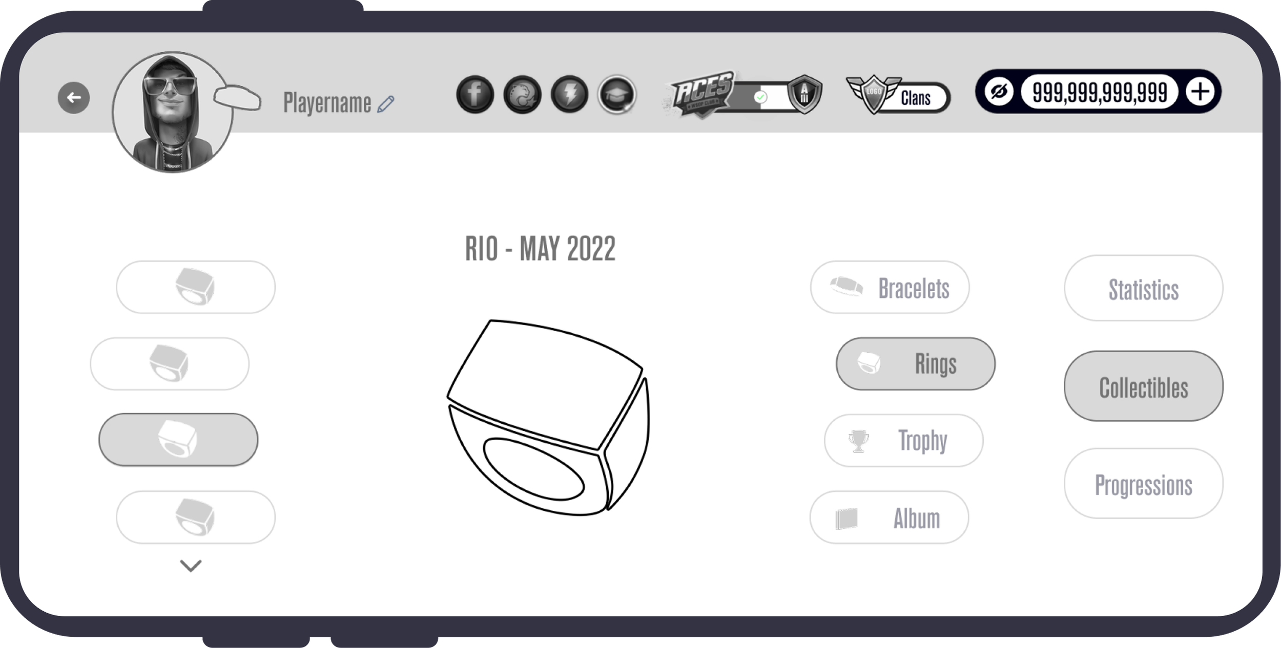
Created low-fidelity wireframes to validate structural changes. Introduced dedicated navigation tabs to separate personal identity, deep statistics, and collectible rewards, establishing a clear visual hierarchy.
2. Interactive Prototyping - Refining Mechanics
Developed high-fidelity prototypes featuring dynamic milestone progress bars, time-period toggles for gameplay data, and an organized visual shelf for collectible assets.


Design Solutions & Screen Breakdown
1. Profile Introduction Screen
The redesigned introduction prioritizes personalization and spatial economy.
- The Improvement: Replaced the static, welcoming text with an animated interaction: upon entry, the central avatar moves into the top navigation bar. This frees up vertical screen space for immediate content exploration and keeps the player's identity visible.

 BeforeAfter
2. Player Statistics
Restructured raw data into scannable insights for competitive players.
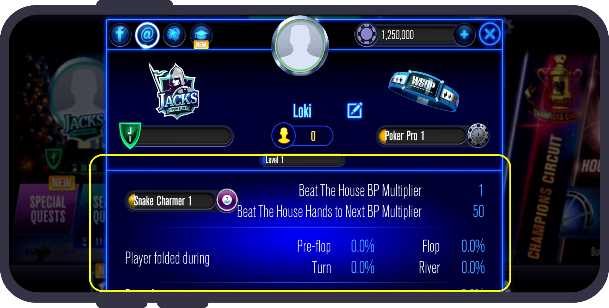
- Before: A dense, text-heavy list that made interpreting playstyles difficult.
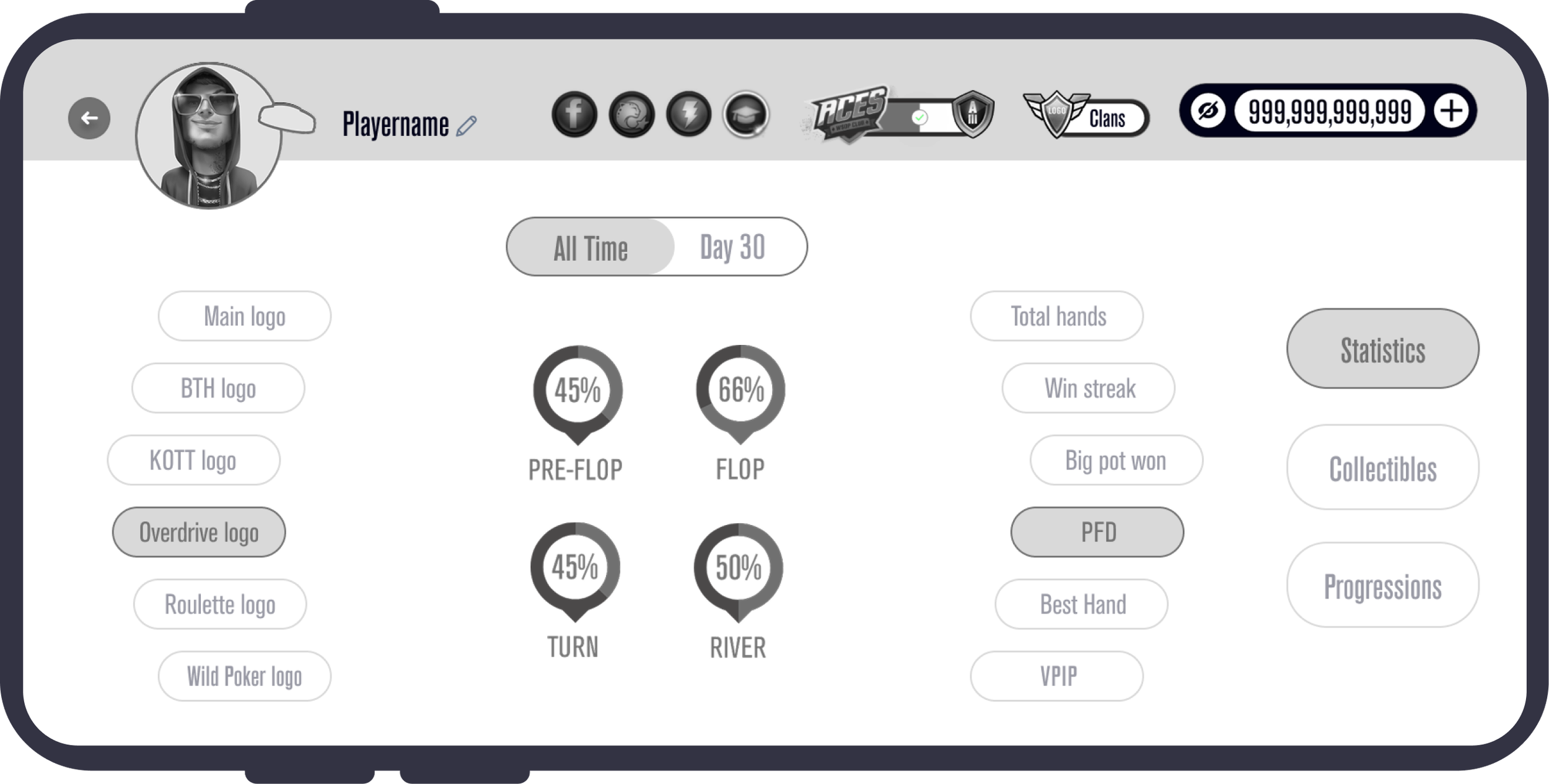
- After: Introduced intuitive visual gauges and cards for key performance indicators (VPIP, best hand, fold behavior). Added an "All Time" vs. "30 Day" time toggle to allow players to track tactical trends and improvement over time.
 BeforeAfter

 BeforeAfter

 BeforeAfter
3. Collectibles & Achievements
Transformed standard notifications into prestigious milestones.
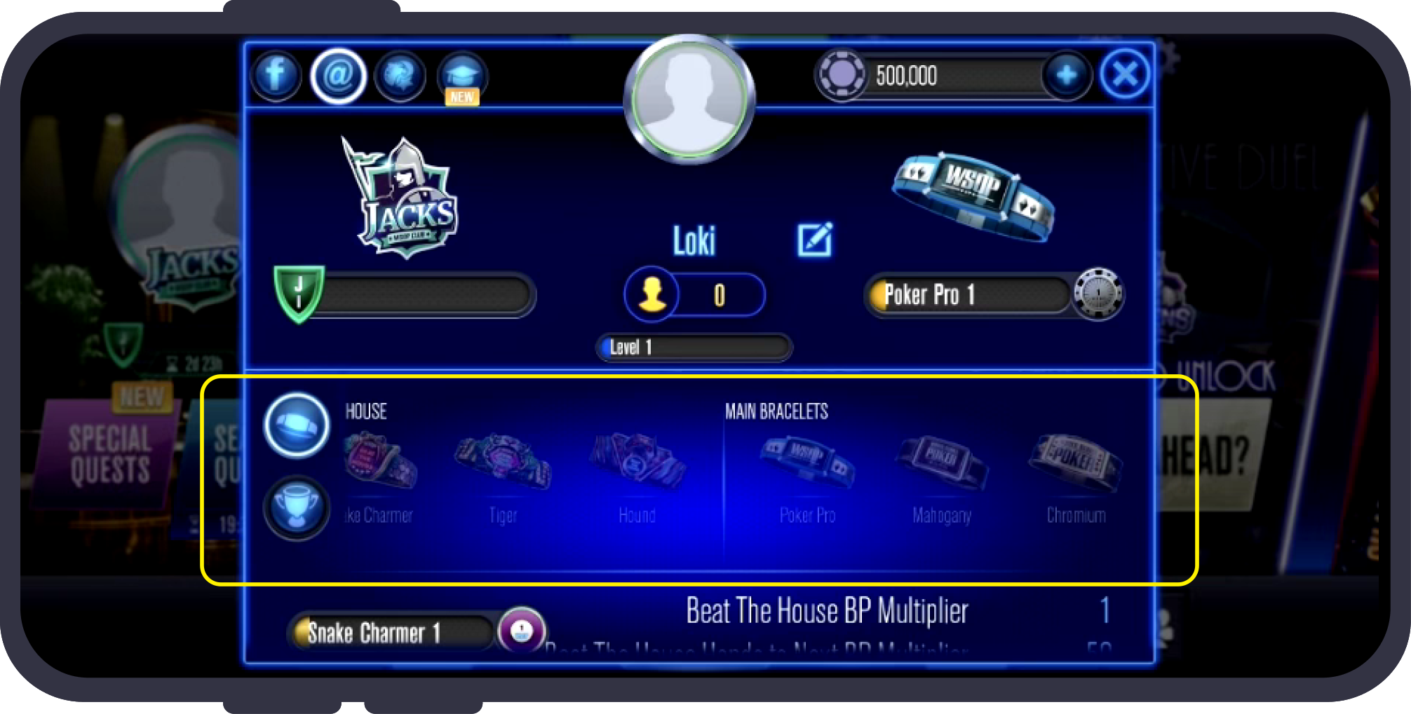
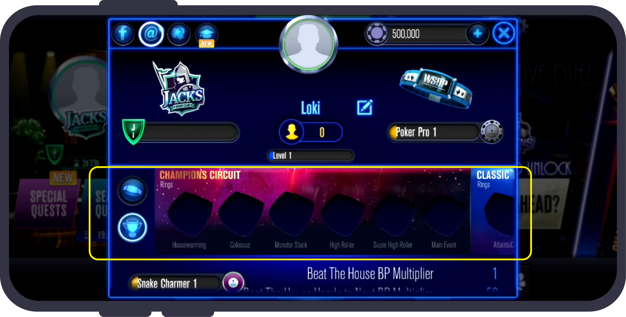
- Before: Flat imagery with no clear organization, reducing the perceived value of hard-earned assets.
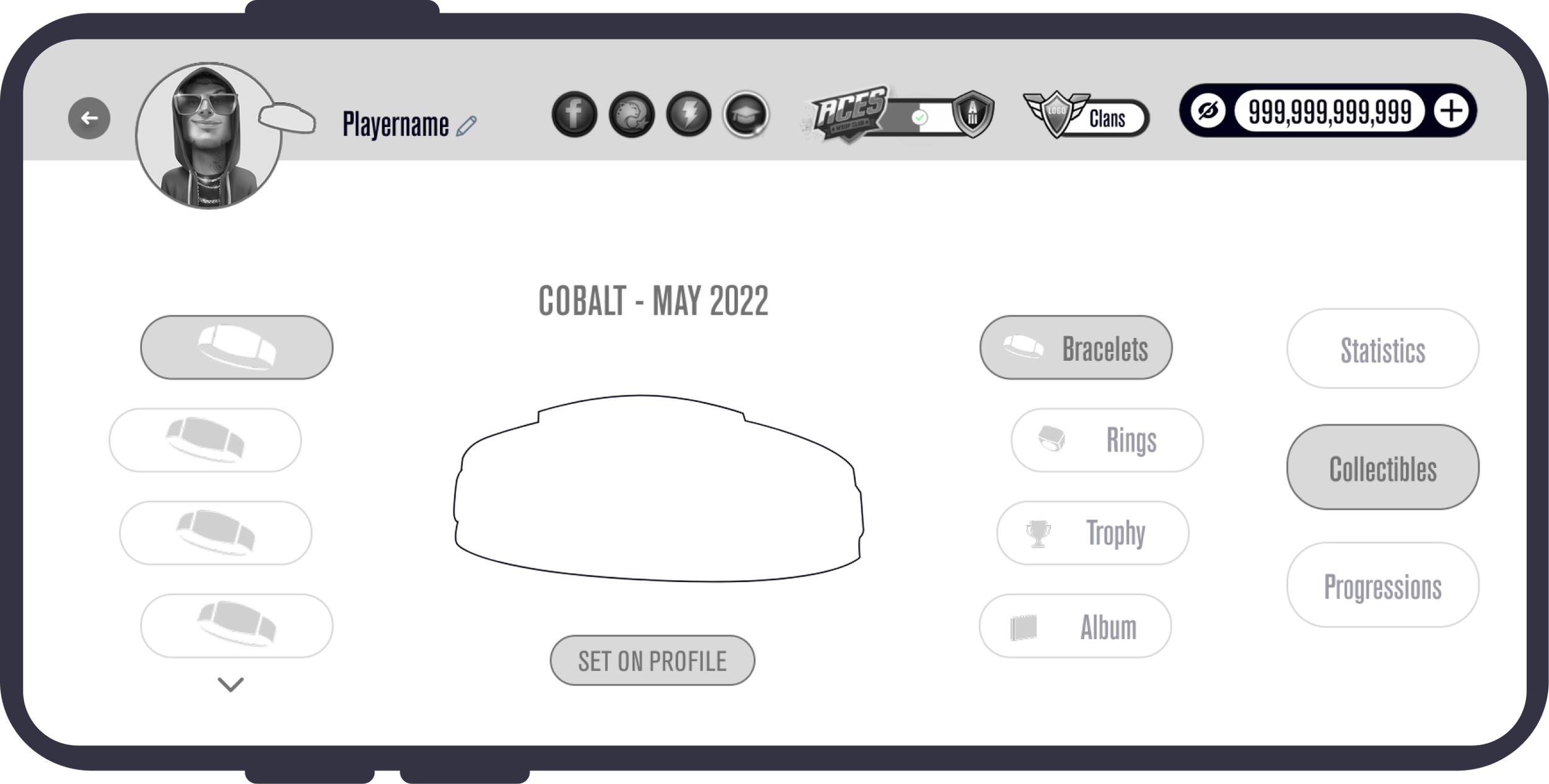
- After: Organized rings and bracelets into distinct, high-resolution categories with numeric progress indicators. Added a "Set on Profile" feature for player self-expression.
 BeforeAfter
 BeforeAfter
Key Takeaways
- Data-Driven Agility: Combining quantitative surveys with competitor benchmarks allowed us to anchor aesthetic changes in established behavioral patterns.
- Designing for Core Motivators: Mid-core players require clear, immediate feedback on investment. Clear progression paths were designed to raise perceived value and player loyalty.
Project Status Update: Due to shifting product roadmaps and core business priorities, implementation of this feature set has been paused. The complete design system and the final prototypes remain ready for future integration.
Outcome
Not measured.